Posts Tagged ‘pandemicgraphs’
What does the other side of the curve look like?
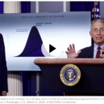
The White House graph looks nothing like what a pandemic is really like. That’s bad news for “opening up the country”.
Read MoreUW model of hospital bed, ICU bed, and ventilator requirements
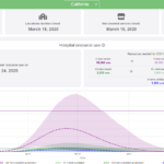
Wondering exactly how bad it’s going to get in the hospitals in your state? Wondering if it’s crazy to keep a quarantine up for this long? It turns out there’s finally enough data that a University of Washington Researcher has created a model for peak usage and then built a sexy, easy to understand graph.…
Read More21 days later
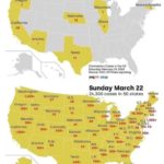
This graph really shows the broad spread of the virus in just 21 days. Modern life, with all its interconnectedness, certainly made us primed for a pandemic. I always thought it would be ebola, or maybe Spanish Influenza. I guess that last one was pretty close.
Read More