UW model of hospital bed, ICU bed, and ventilator requirements
Wondering exactly how bad it's going to get in the hospitals in your state? Wondering if it's crazy to keep a quarantine up for this long? It turns out there's finally enough data that a University of Washington Researcher has created a model for peak usage and then built a sexy, easy to understand graph.
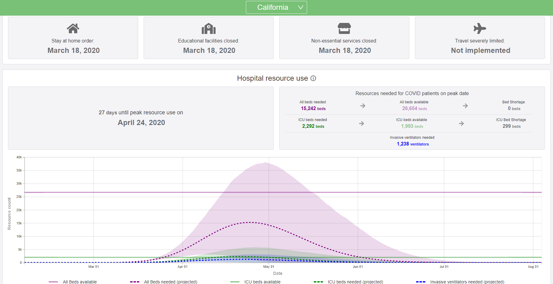
This graph needs some explanation. First, look at the lines and ignore the shaded area. The lines show daily usage requirements. Now look at the purple shaded area. You understand if you need 100 new hospital beds every day, that means on the fifth day you're using 500? That's why the purple shaded area is above the purple dotted line. That's your complete daily requirement of beds.
The same logic applies to the ICU beds. Given an early CDC estimate of a 12% hospitalization rate, that number will have to go down or we'll spend a lot of time without any ICU beds available. I can't tell you what their model uses for a hospitalization rate because the link to the original paper is broken.
This does it nationally, and then has breakdowns by state. But truthfully, talking to my friends in healthcare, you're only really going to have access to what's regional to you. Transporting infectious patients is a huge risk nobody really wants to take, so whatever you've got near you that you go to first is exactly where you're going to end up.